Color grading is the process of adjusting the colors of an image or video to create a specific look or mood. In photography and design, color grading plays a critical role in establishing the visual identity of a brand. It is a creative process that requires skill and artistry to achieve the desired result. In this article, we will discuss the art of color grading in photography and design and explore how businesses can use color grading to create a compelling visual identity.
Understanding Color Grading
Color grading is the process of adjusting the colors of an image or video to create a specific look or mood. It involves manipulating the hue, saturation, and brightness of the colors in an image or video to create a cohesive and visually appealing look. The goal of color grading is to create a consistent visual identity that reflects the brand’s values and message.
Color grading is a creative process that requires skill and artistry to achieve the desired result. A skilled colorist can take an image and transform it into a work of art that tells a story and evokes emotions in the viewer.
Color Grading in Photography
In photography, color grading is often used to create a specific mood or style. For example, warm and earthy tones can create a cozy and intimate feel, while cool tones can create a sense of calm and serenity. Bold and vibrant colors can create a playful and energetic feel, while muted tones can create a more sophisticated and understated look.
Color grading is often used in fashion and lifestyle photography to create a specific mood or style that aligns with the brand’s identity. For example, a luxury fashion brand might use warm and earthy tones to create a cozy and intimate feel, while a casual clothing brand might use bold and vibrant colors to create a playful and energetic look.
Color Grading in Design
In design, color grading is used to create a consistent visual identity that reflects the brand’s values and message. A skilled designer can use color grading to create a specific mood or style that aligns with the brand’s identity.
Color grading is often used in branding and marketing materials, such as logos, websites, and social media graphics. For example, a tech company might use cool and muted tones to create a more sophisticated and understated look, while a food company might use warm and vibrant colors to create a playful and inviting feel.
Tools and Techniques
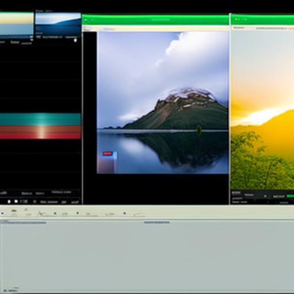
There are many tools and techniques that photographers and designers can use to achieve the desired color grading effect. Some popular software tools for color grading include Adobe Photoshop, Lightroom, and Premiere Pro. In addition to software, color grading can also be achieved through the use of filters, presets, and manual adjustments.
When using color grading tools and techniques, it’s essential to have a clear understanding of the brand’s values and message. The color grading should align with the brand’s identity and create a consistent visual language that customers can recognize and remember.
Conclusion
Color grading is an essential part of photography and design that plays a critical role in establishing a brand’s visual identity. It is a creative process that requires skill and artistry to achieve the desired result. By using color grading to create a specific mood or style that aligns with the brand’s identity, businesses can create a compelling visual identity that resonates with customers and sets them apart from their competitors.